Part I: Overview
Design Roles
- Researcher
- UX/UI Designer
- Visual Designer
Deliverables
- User Survey
- Competitive Analysis
- Personas
- User Stories
- User Flows
- Sketches
- Wireframes
- Usability Tests
- Branding
- High Fidelity Mockups
- Prototype
Tools
- Figma
- Draw.io
Summary
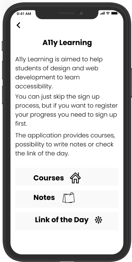
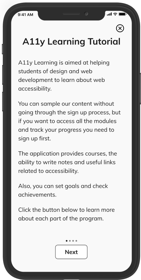
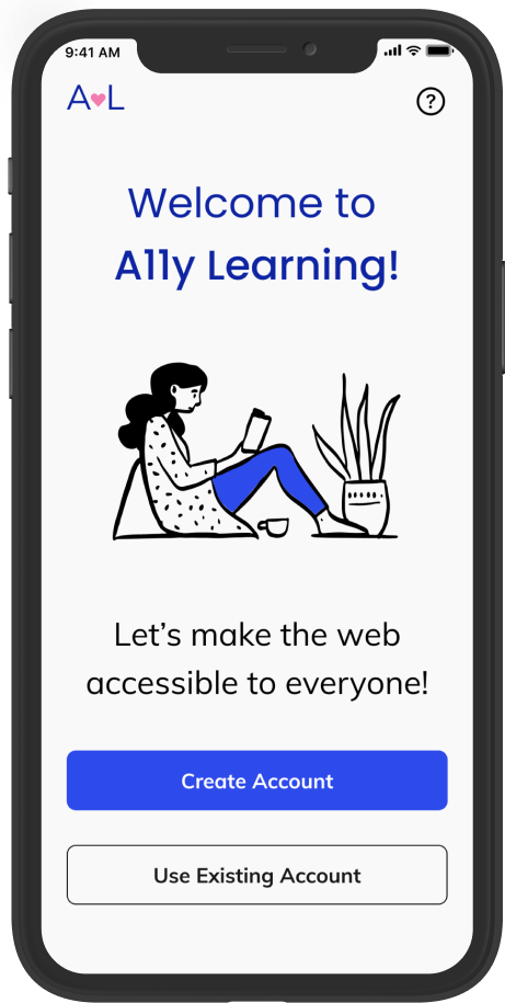
A11y Learning is aimed to help students of design and web development to learn about accessibility so they can create accessible products for everyone.
A11y learning provides quick quizzes and links about accessibility, and an option to create notes about what you have learned.
The outcome of this project highlights the importance of creating web pages and apps that everyone can use.
Challenge
Many designers and developers do not apply accessibility guidelines due to the complexity and lack of time to study the subject.
My Responsibilities
As the solo designer on the A11y Learning project, I led the end-to-end design process. I conducted user research, including surveys and competitive analysis, to identify key barriers to accessibility. I created personas, user stories, and user flows to inform the design strategy. I developed sketches, wireframes, high-fidelity mockups, and iterated on prototypes based on usability testing feedback. Additionally, I crafted the branding elements, including the logo, color palette, and typography, to ensure a cohesive user experience.
Part II: Research and Discovery
User Survey
I conducted a User Survey, where I obtained 33 responses to understand why students do not apply accessibility guidelines and to assess the potential success of an accessibility learning application. I learned that:
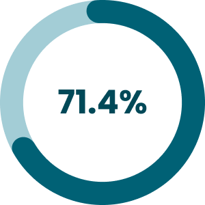
are familiar and interested in web accessibility
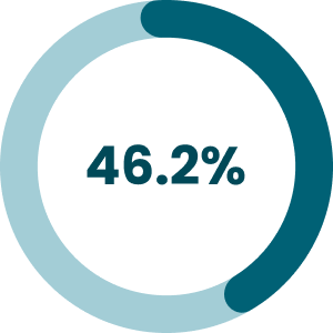
do not apply any accessibility rules
do not have the knowledge

do not have time to study the subject
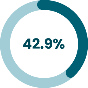
do not have time to apply it
there are so many rules
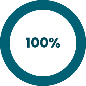
Also, I asked how much time per week they spent last semester trying to learn accessibility and how much time per day would be reasonable for them to learn the subject. I learned that:
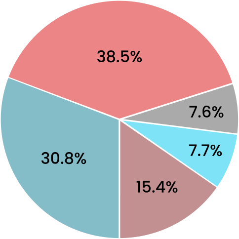
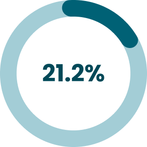
0-1 hour (30.8%)
1-2 hours (38.5%)
2-3 hours (7.7%)
3-4 hours (15.4%)
None (7.6%)
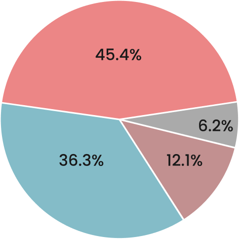
15 min (45.5%)
30 min (36.3%)
1 hour (12.1%)
None (6.2%)
User Personas
Based on the research process, I created three personas to represent potential users: Nicole, David, and Sofia.
Nicole- UX Design Student
- Age: 25
- Location: Santa Monica-CA
Goals
- Study web accessibility for 15 minutes per day
- Use her commute time to study
- Make a difference in the lives of many people
Frustrations
- She thinks there are so many rules about web accessibility
- She does not know which resource could help learn web accessibility
- She does not have a lot of time to study

I would love to learn more about web accessibility, but I think it is really complicated. It’s time-consuming.

David- UX Design Student
- Age: 33
- Location: Chicago-IL
Goals
- Learn about color contrast
- Use a maximum of 30 minutes per day to learn about web accessibility
- Create products that are accessible to everyone
Frustrations
- He wishes his school taught web accessibility guidelines
- There are so many rules to learn
- He has a very busy life
I need to start applying web accessibility guidelines to my projects because everyone has the right to use the internet.

Sofia- Computer Science Student
- Age: 22
- Location: Sao Paulo-SP-Brazil
Goals
- Study web accessibility every day
- Use her lunchtime to learn
- Start applying the guidelines in her projects
Frustrations
- She does not have the knowledge about the web accessibility rules
- She cannot spend too much time learning it
- The school is not going to teach it until the third year
I would love to apply the accessibility guidelines in my projects as soon as possible.
Part III: Information Architecture
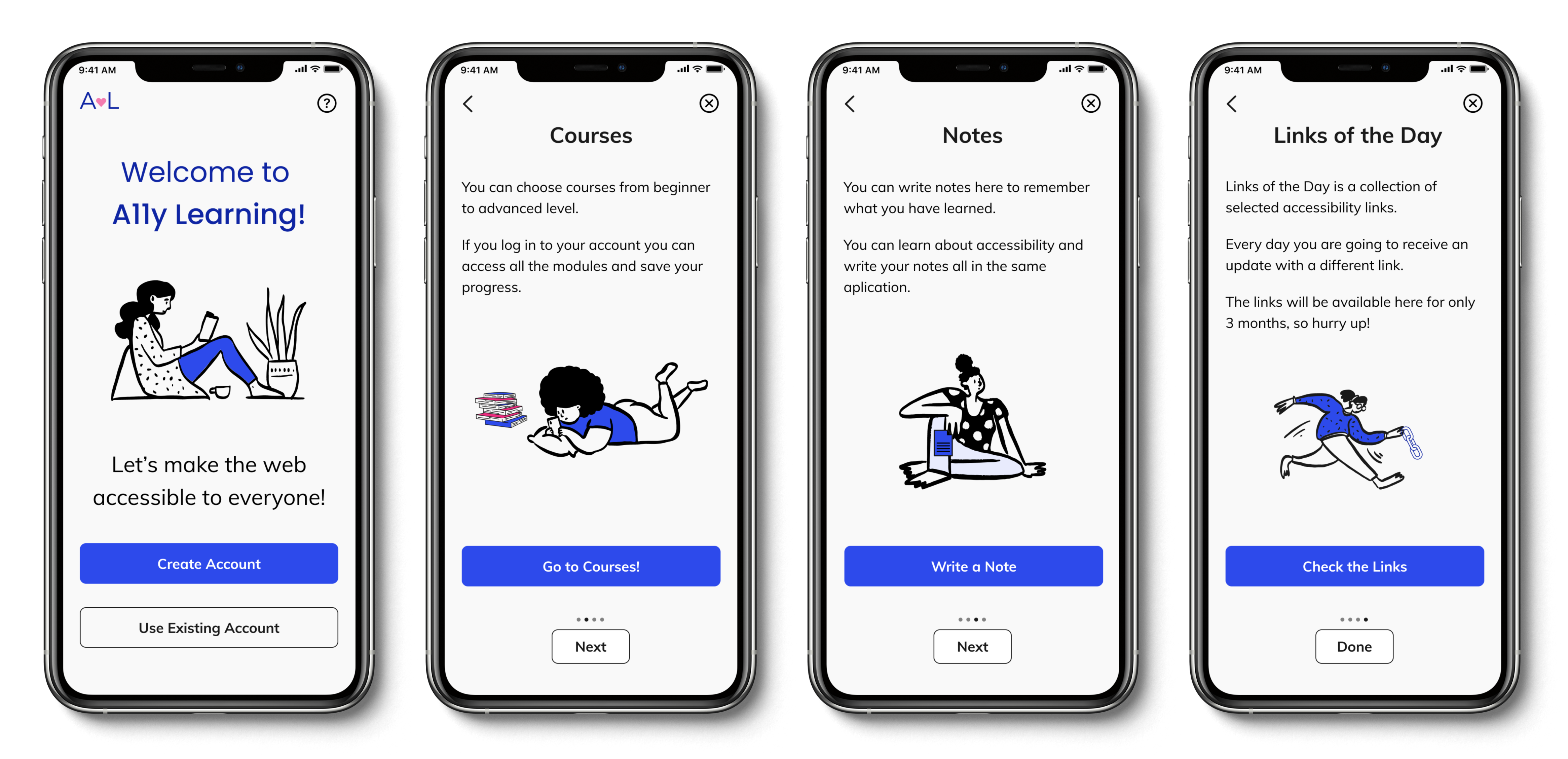
User Flows

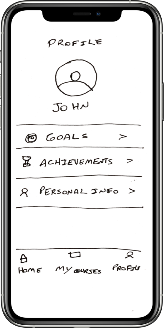
Sketches & Wireframes
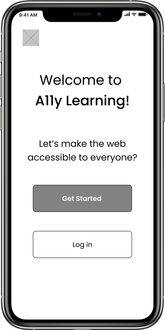
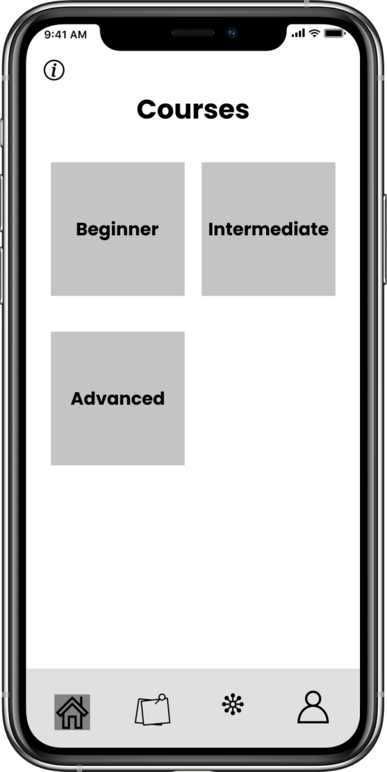
Initial sketches and wireframes of the main pages (Landing, Homepage, Profile) to outline the app’s layout and functionality, ensuring a user-centric structure.
Landing Page
Homepage
Profile
Part IV: Branding and Identity
Branding
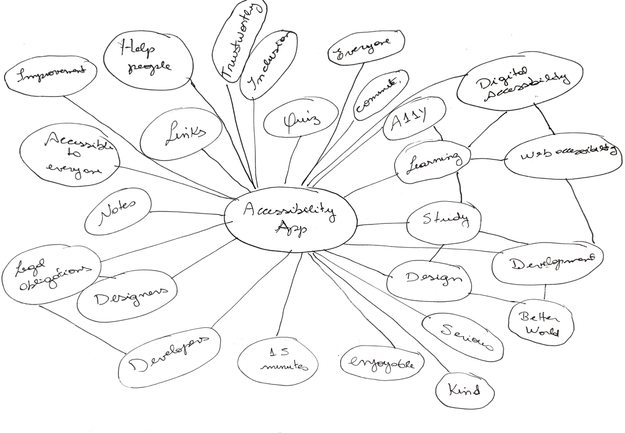
I started the branding process with a brainstorming and sketching session to come up with some ideas for the name and logo.
Name
I wanted the name of my product to include the word accessibility and also something that explains what the application is about. First, I considered Accessibility Learning, but this name is too long, so I found a shorter way to express accessibility: A11y, which is divided into A + 11 letters (C-C-E-S-S-I-B-I-L-I-T) + Y.
A + 11 letters (C-C-E-S-S-I-B-I-L-I-T) + Y = A11Y
Colors
After that, I created a mood board to show the brand’s characteristics and a style guide to document the typography and the color palette that I have chosen for this project.
As a primary color for this project I have chosen blue, and pink as a secondary color. I wanted to make sure that the colors were accessible, so I checked the background and foreground to make sure that it is reaching at least 4.5:1 of contrast.
According to the psychology of colors, blue is a color that reflects calm, relaxation, stability, trust, and loyalty. Additionally, pink is a color that is associated with love, kindness, and compassion.
A11y Learning wants users to see the platform as a source of trustworthy support where they can learn a new skill that will transform people’s lives for the better.
Primary Color
-
10
#E8EBFD
-
20
#B9C3F8
-
30
#7C88F3
-
40
#2D4AEB
-
50
#1430D2
-
60
#0F25A3
Secondary Color
-
10
#FDE8F1
-
20
#F8B9D4
-
30
#F37CAF
-
40
#EB2D7F
-
50
#D21465
-
60
#D21465
Typography
I have chosen Mulish because it is a sans serif minimalist typeface that conveys the brand identity, trustworthy and joy.
Mulish
Regular | SemiBold | Bold
Everyone has to have the same right to use websites or applications. Something needs to be done to create knowledge and conscious awareness to make the lives of people with disabilities easier when using sites or applications.
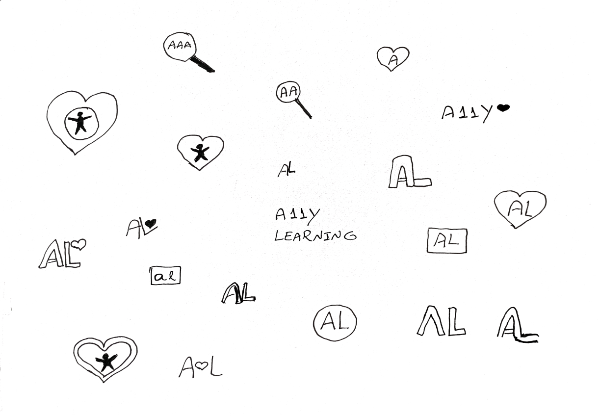
Logo
In sequence, I created a logo for my brand, which consists of an A and L, plus a heart icon. A stands for A11y and L stands for Learning. The heart symbolizes that through love we can change people's lives and have an accessible web for everyone.
Part V: Visual Design
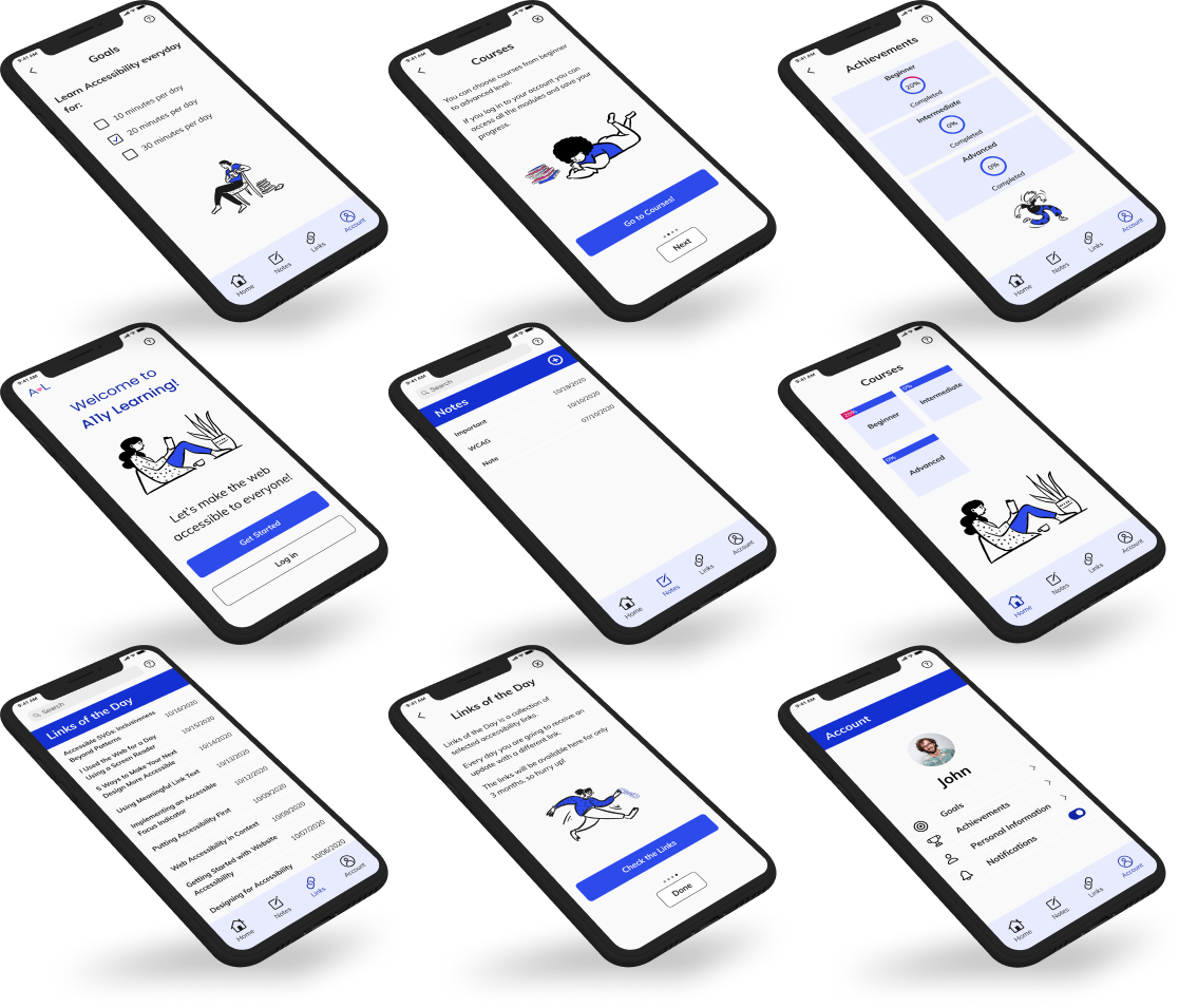
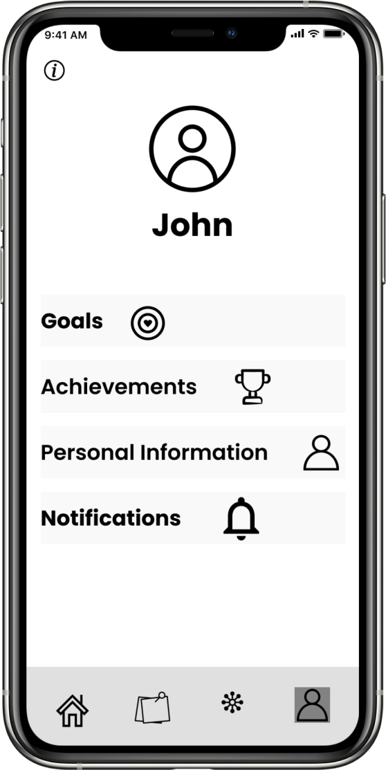
High Fidelity Mockups
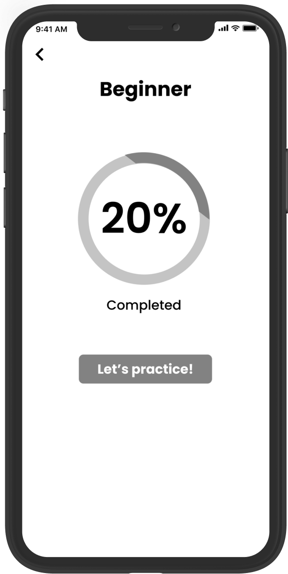
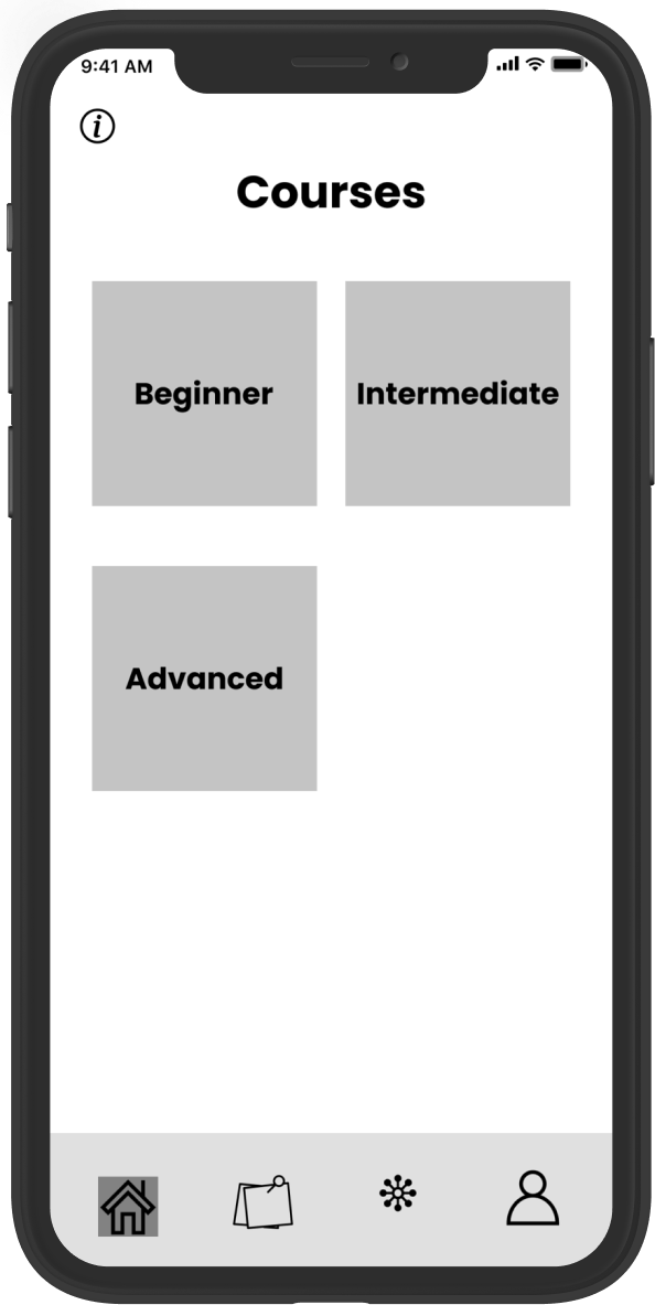
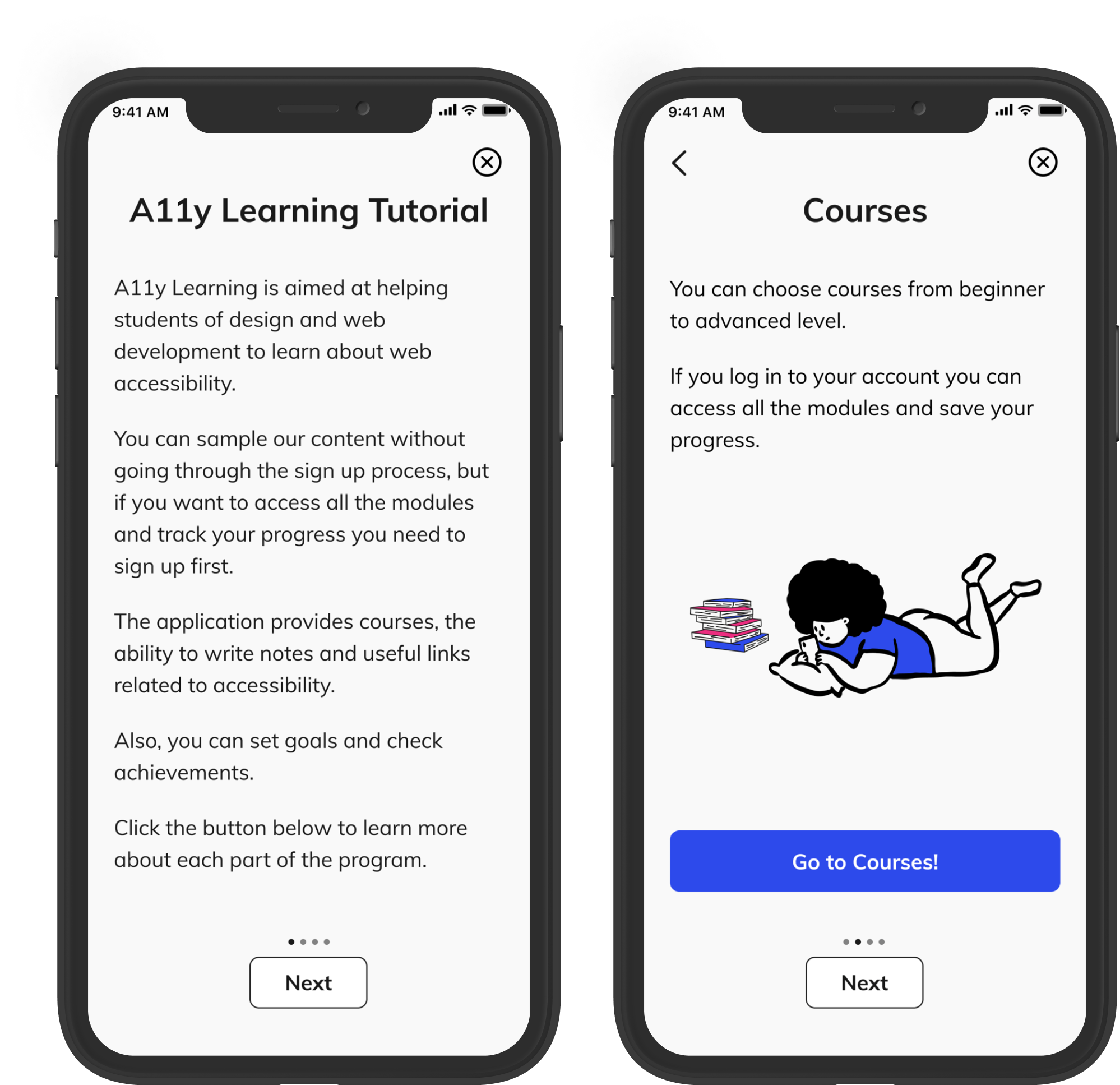
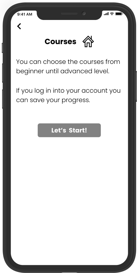
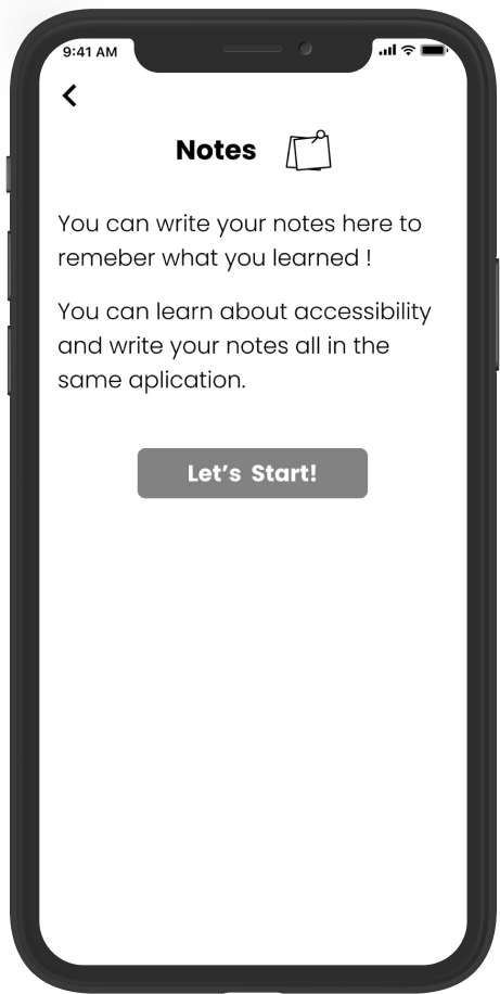
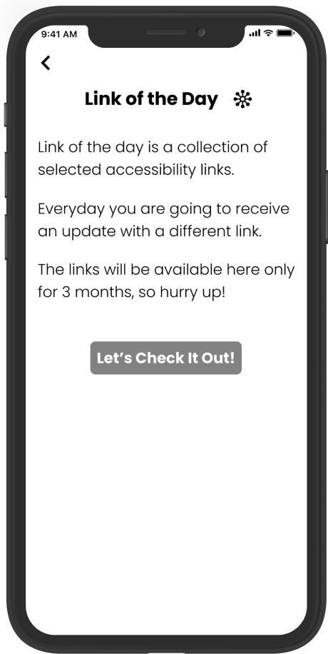
I received important feedback on my wireframes from my mentor and other teachers of the program, so I made some changes to the high fidelity mockups to improve usability. For example, I removed one page from the quiz start-up process by adding the course progress to the same page where I display the course levels.
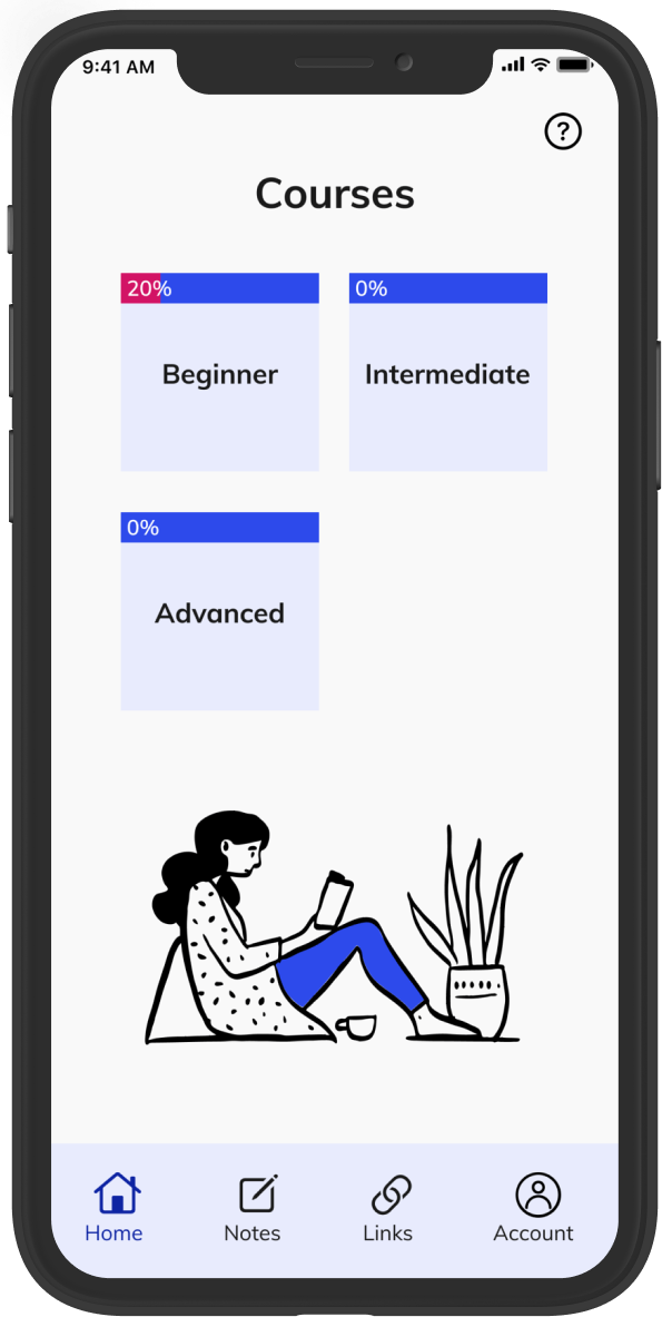
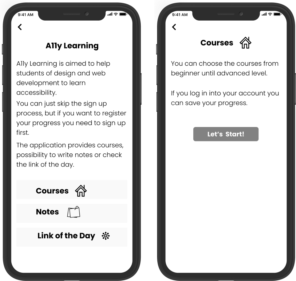
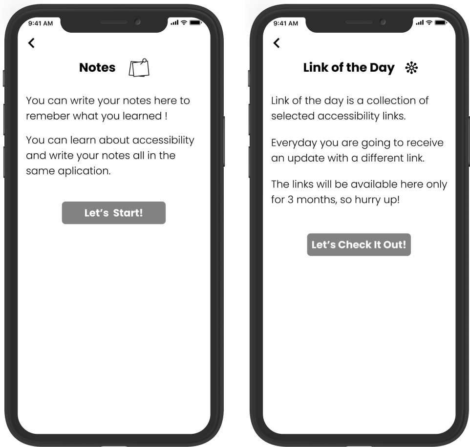
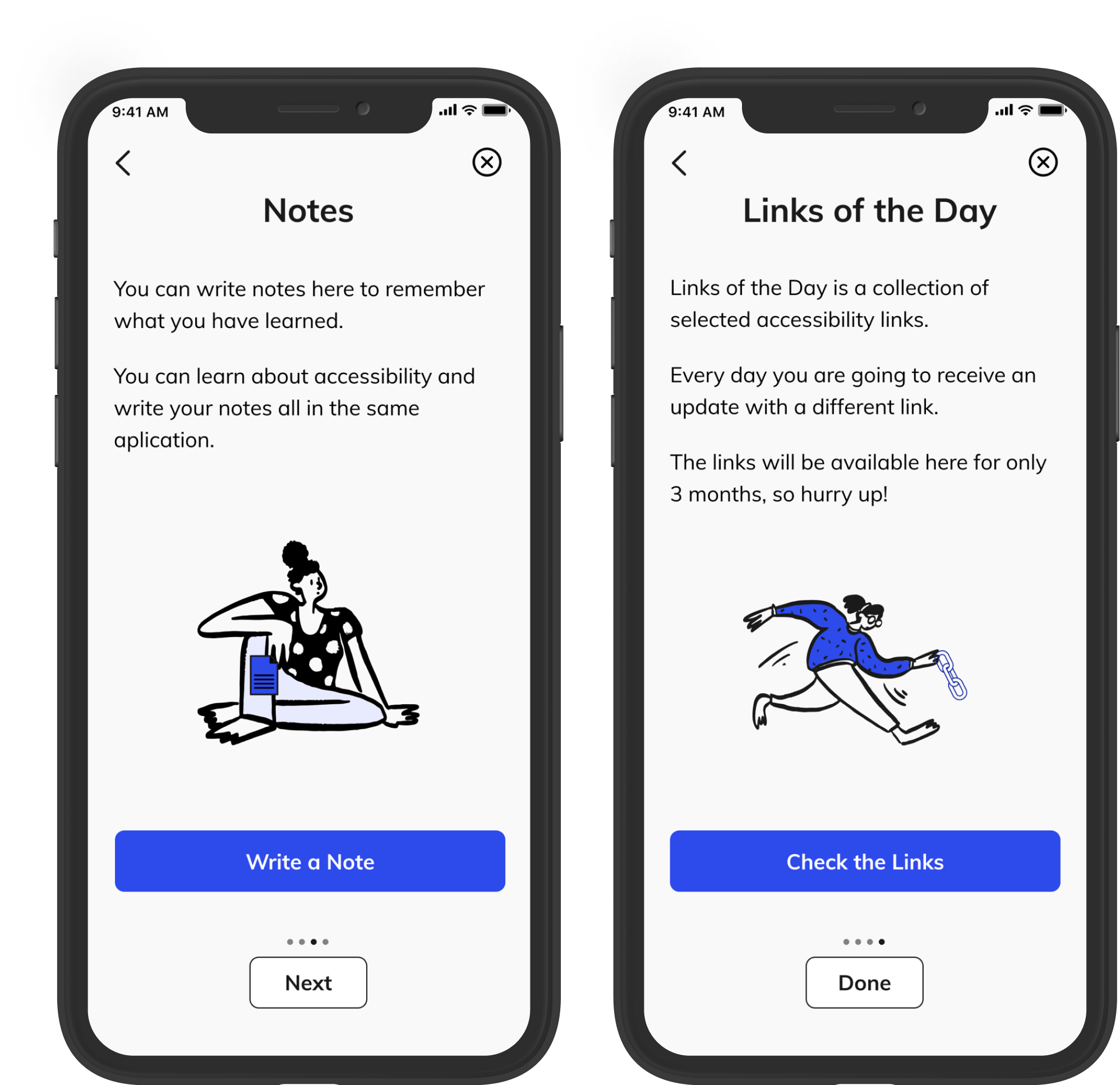
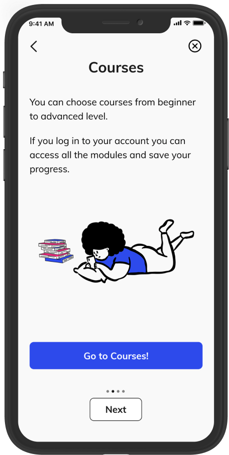
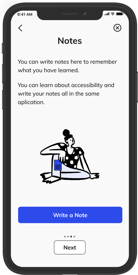
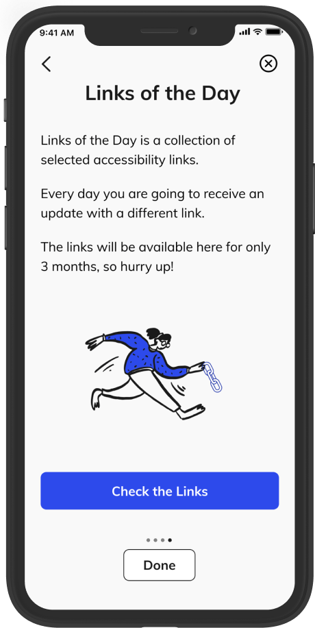
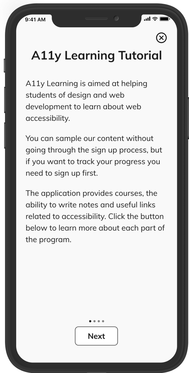
Also, I added some illustrations to the tutorial pages to eliminate the awkward ample white space and moved all the buttons to the bottom of the page to show consistency.
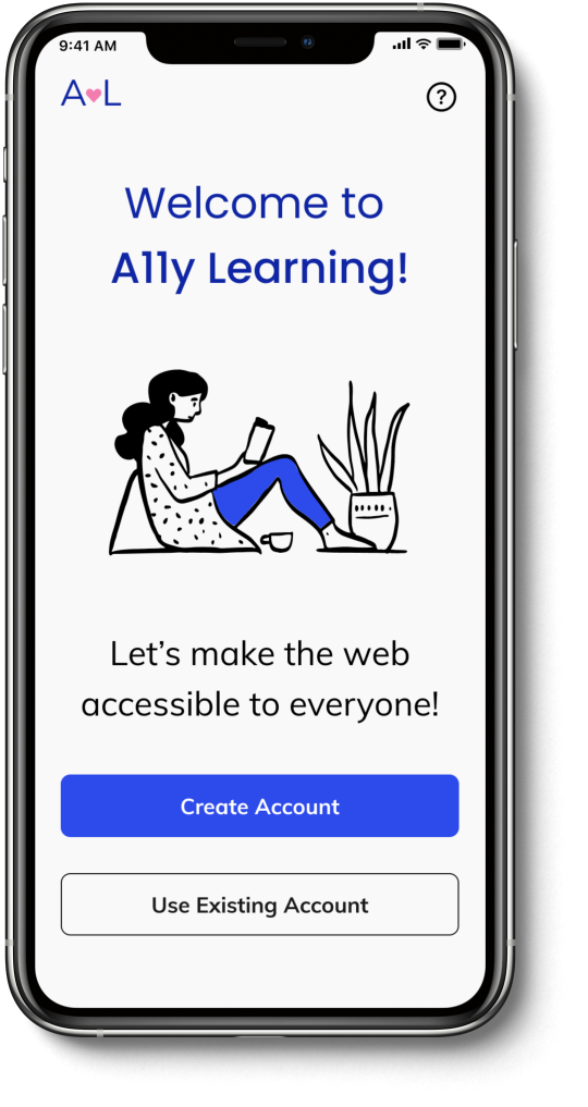
Prototypes and Usability Testing
After that, I did the prototypes and conducted usability tests with three users to improve the usability in the early stages. Here are some iterations that I made based on the feedback I received.
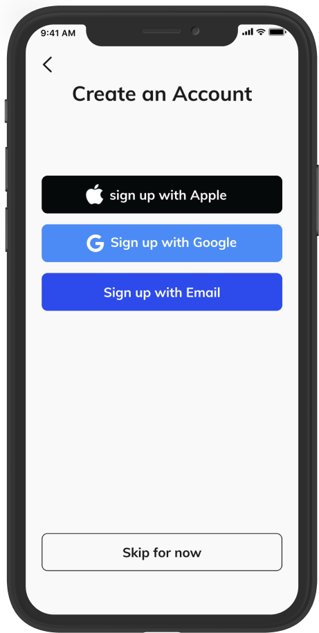
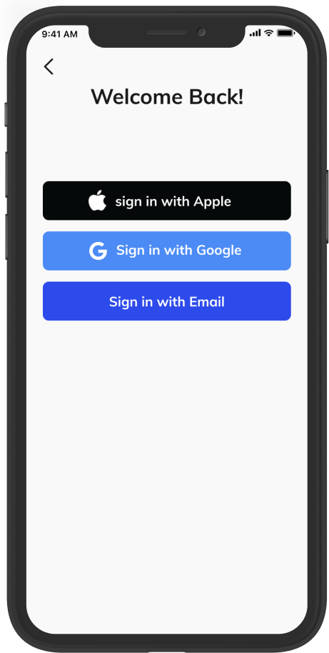
1. I changed “Log In” from the landing page by “Use Existing Account” to be more clear to users. Besides that, on the other pages, I am using the expressions “Sign in” and “Sign up” to have more consistency and not to create confusion.
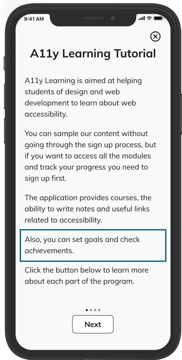
2. I added the information about goals and achievements in the tutorial.
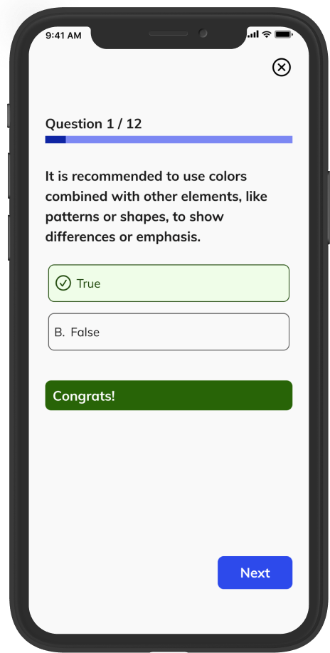
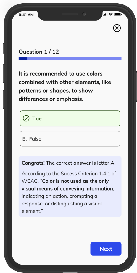
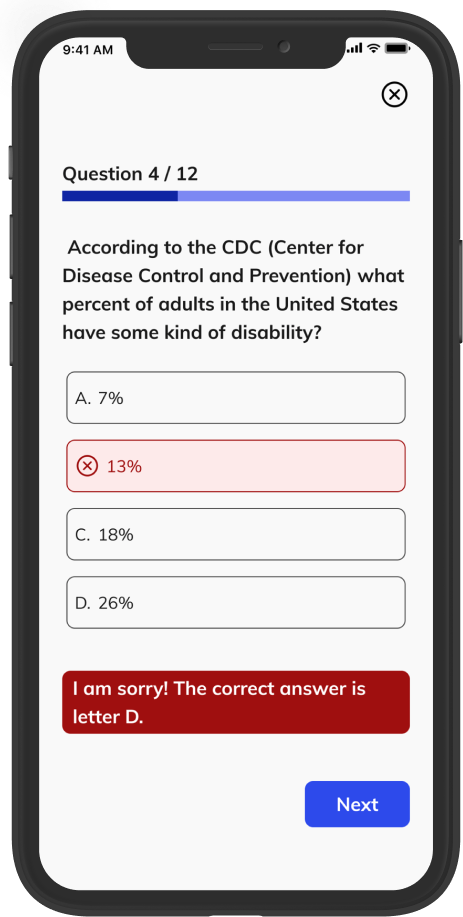
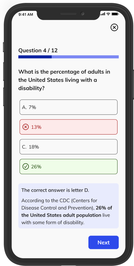
3. I added the explanation of why the quiz answer is right or wrong.
Conclusion
The problem identified was that many designers and developers do not apply accessibility guidelines, primarily due to a lack of time and the overwhelming number of rules to learn. Through research, it was found that a lack of knowledge is a significant barrier. A11y Learning, a quiz-based application, was created to help users learn accessibility in their free time. The app offers quick quizzes, accessibility resources, and a feature to create personal notes.
This project emphasizes the importance of creating accessible digital experiences, which supports diversity and benefits everyone.
Prototype